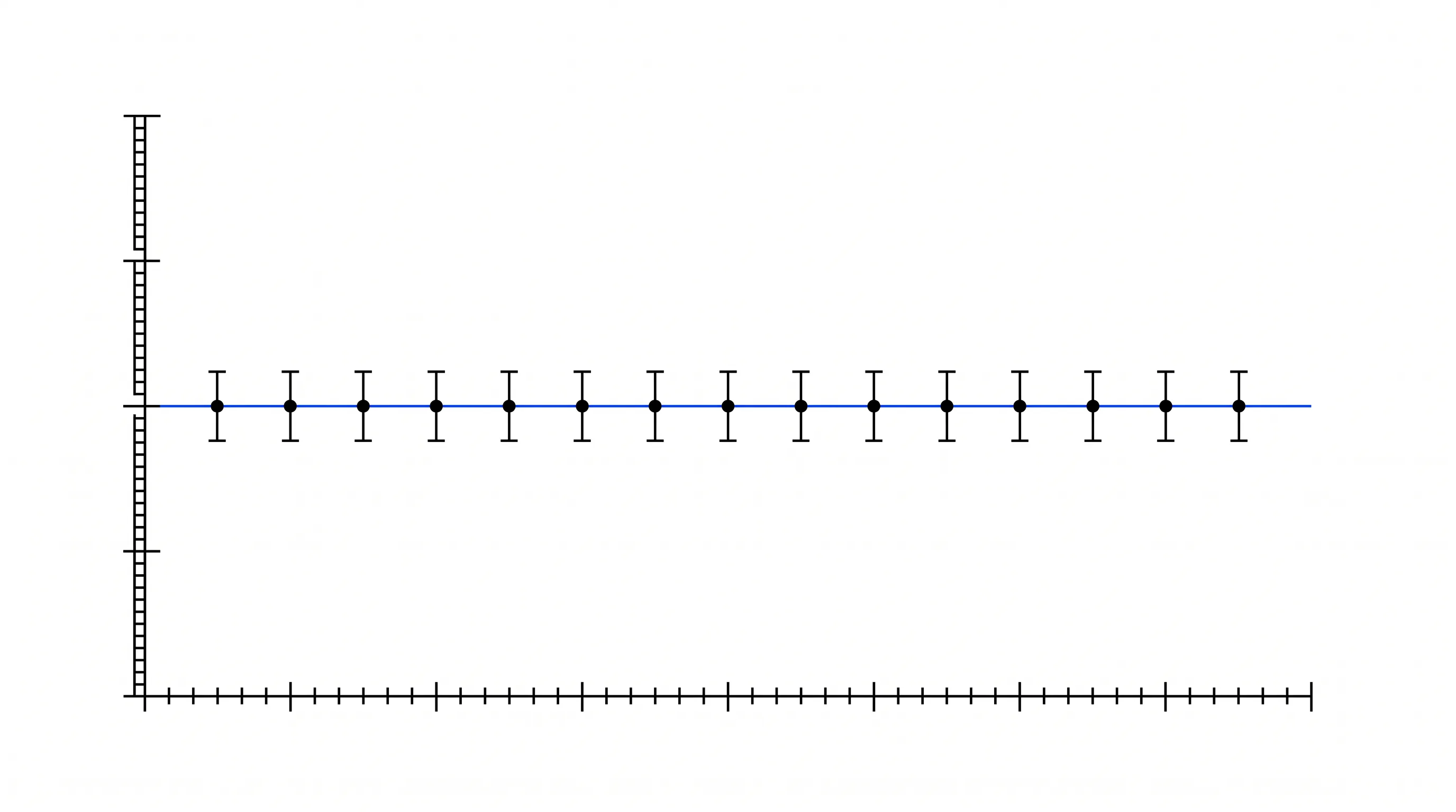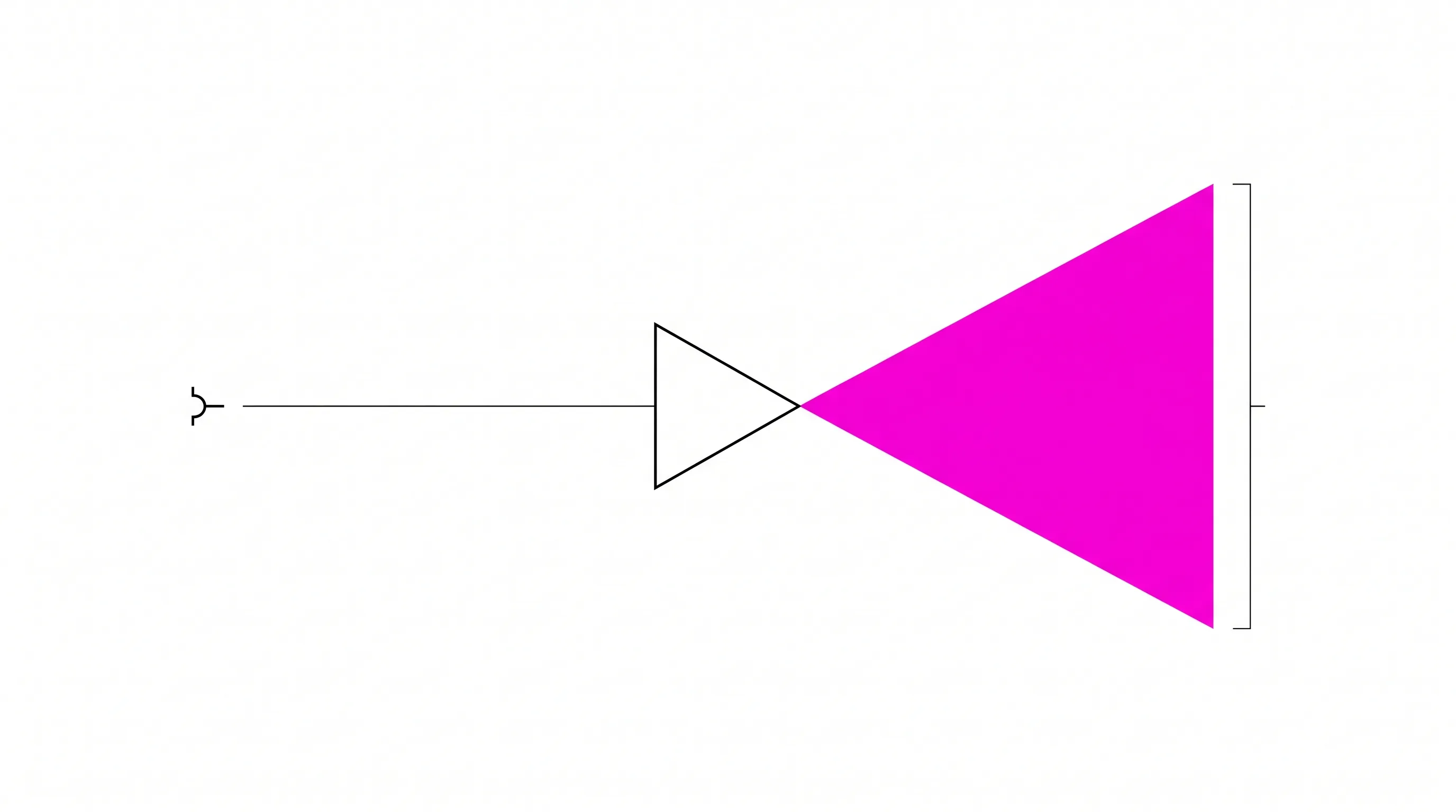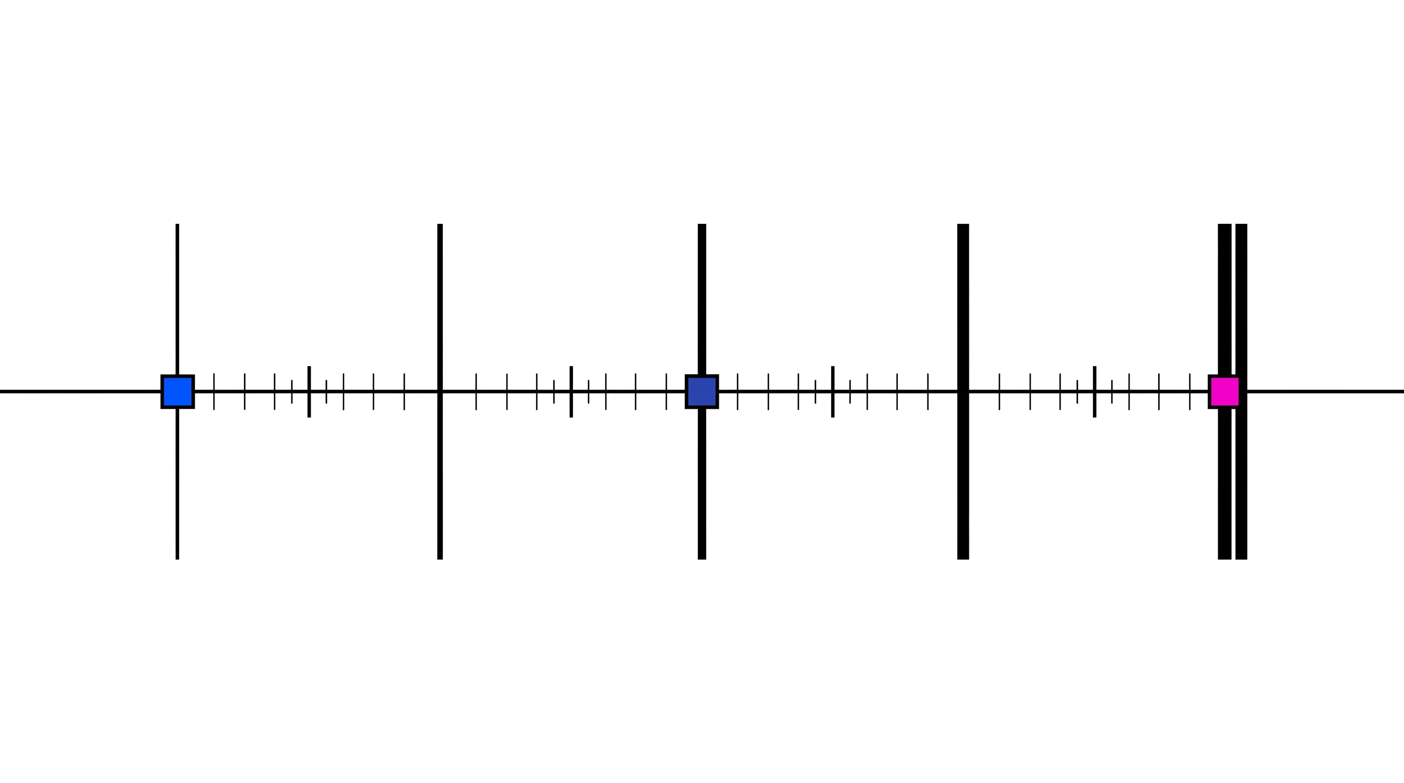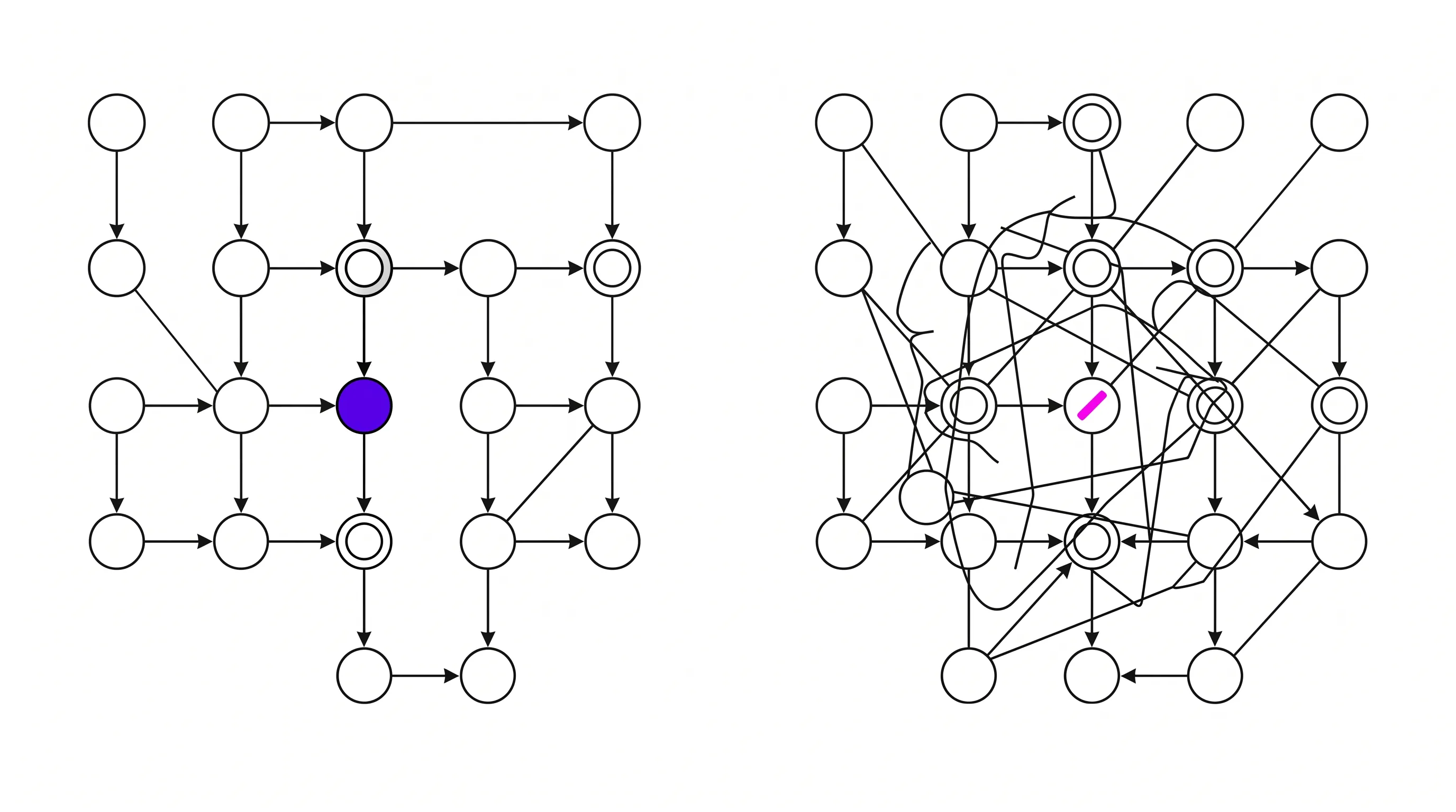
A figure has a hierarchy whether or not anyone designed one. Scientific review pushes toward addition.
The pattern
The mechanism figure has eleven labeled elements, four arrow types, two membranes, a legend and an inset. It is accurate. The science team reviewed it and confirmed that nothing is missing.
Nothing being missing is the problem.
Why it breaks
A figure is a hierarchy whether or not anyone designed one. The viewer sees one element first and groups elements together. The viewer reads anything with an arrow as causal.
When nobody makes those decisions on purpose, accident makes them. The largest element wins, or the most saturated, or whichever one happened to end up in the center. The drawing’s incidental properties direct the viewer’s eye, and the argument gets no say.
Scientific review makes this worse because it checks for accuracy and completeness. Reviewers ask “Is anything wrong?” and “Is anything missing?”, and both questions push toward addition. Nobody in that review asks whether an investor can find the point in four seconds.
So the figure grows. Each addition is defensible on its own and the cumulative effect is a picture with no focal point, which the viewer resolves by never examining it.
What changes
Decide what the figure has to establish before deciding what it contains.
A figure that has to show causality needs direction and sequence, and can drop anything that does not participate in the chain. A figure that has to show comparison needs a shared baseline and two things. Seven is too many. A figure that has to show scale needs one reference the viewer already understands.
Then rank the elements. One focal point. A supporting layer that is quieter on purpose, with thinner strokes and lower contrast. Its labels are smaller. A context layer that is close to silent. Anything that does not fit those three tiers is a second figure.
And where the content has states, sequence or a decision point, one frame is the wrong format. That is what a sequence of figures, or an interactive one, is for.
The practical result
The figure gets a focal point, and a viewer who spends four seconds on it comes away with the right idea.
Accuracy does not fall. The detail that came out of the frame goes into a caption, an appendix figure, or a second panel. The people who want it read it there, in the place they will look for it.