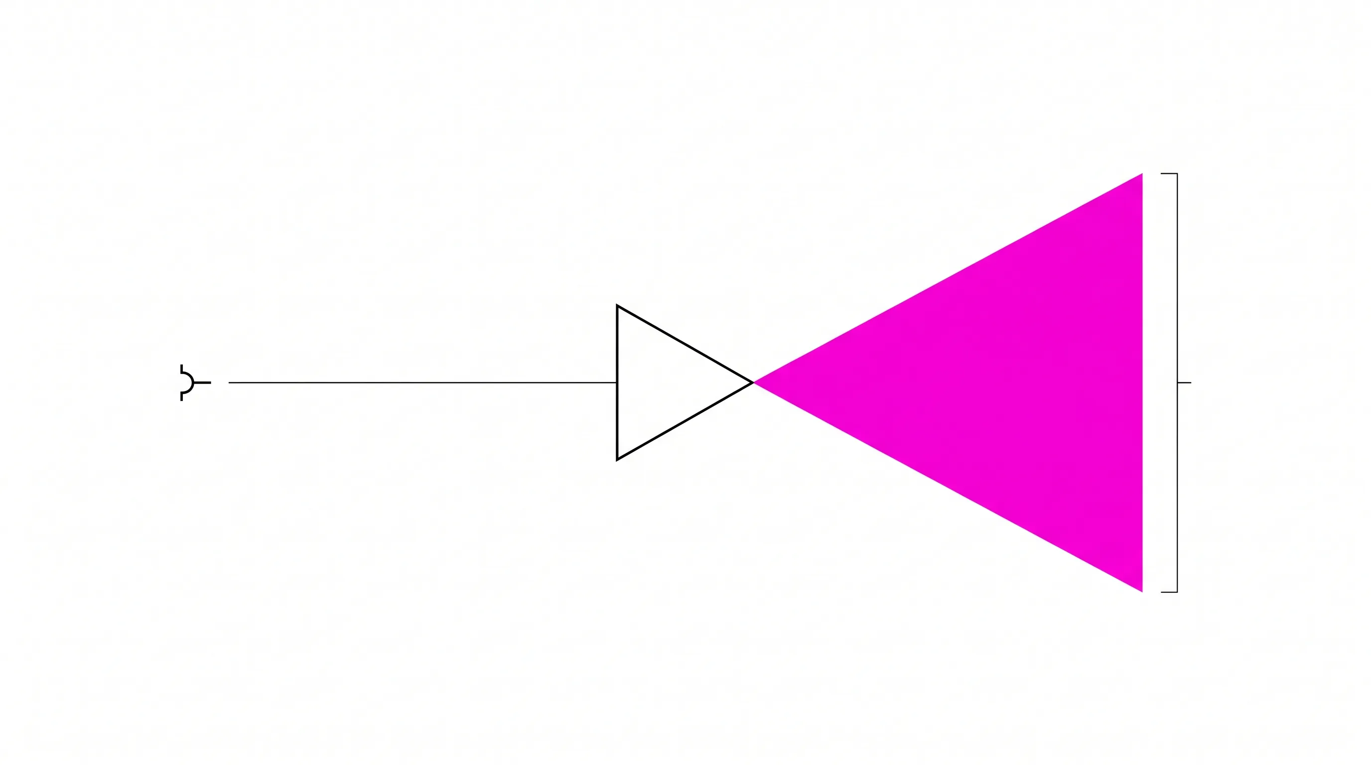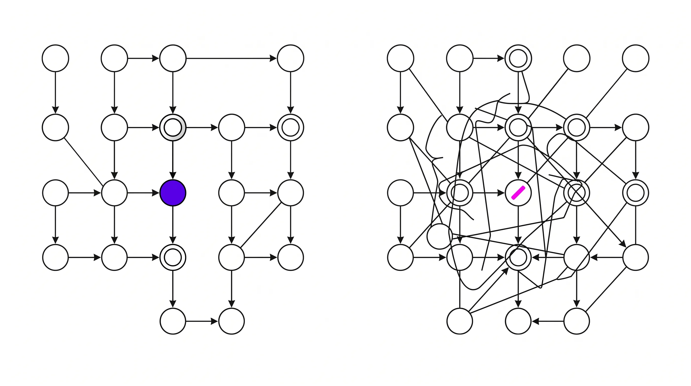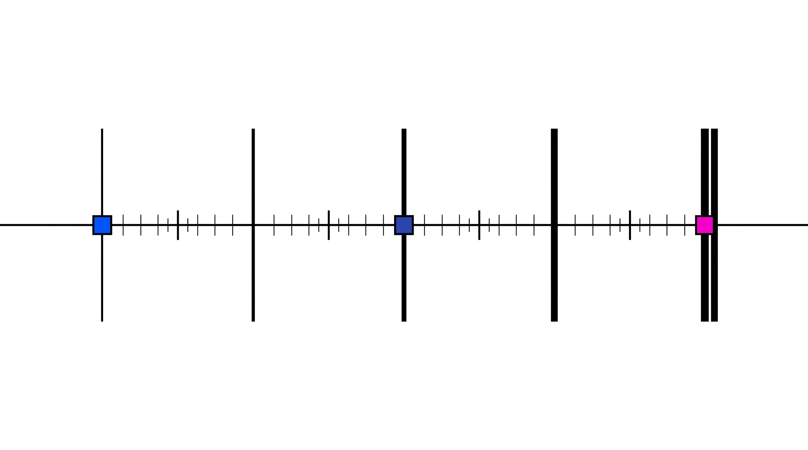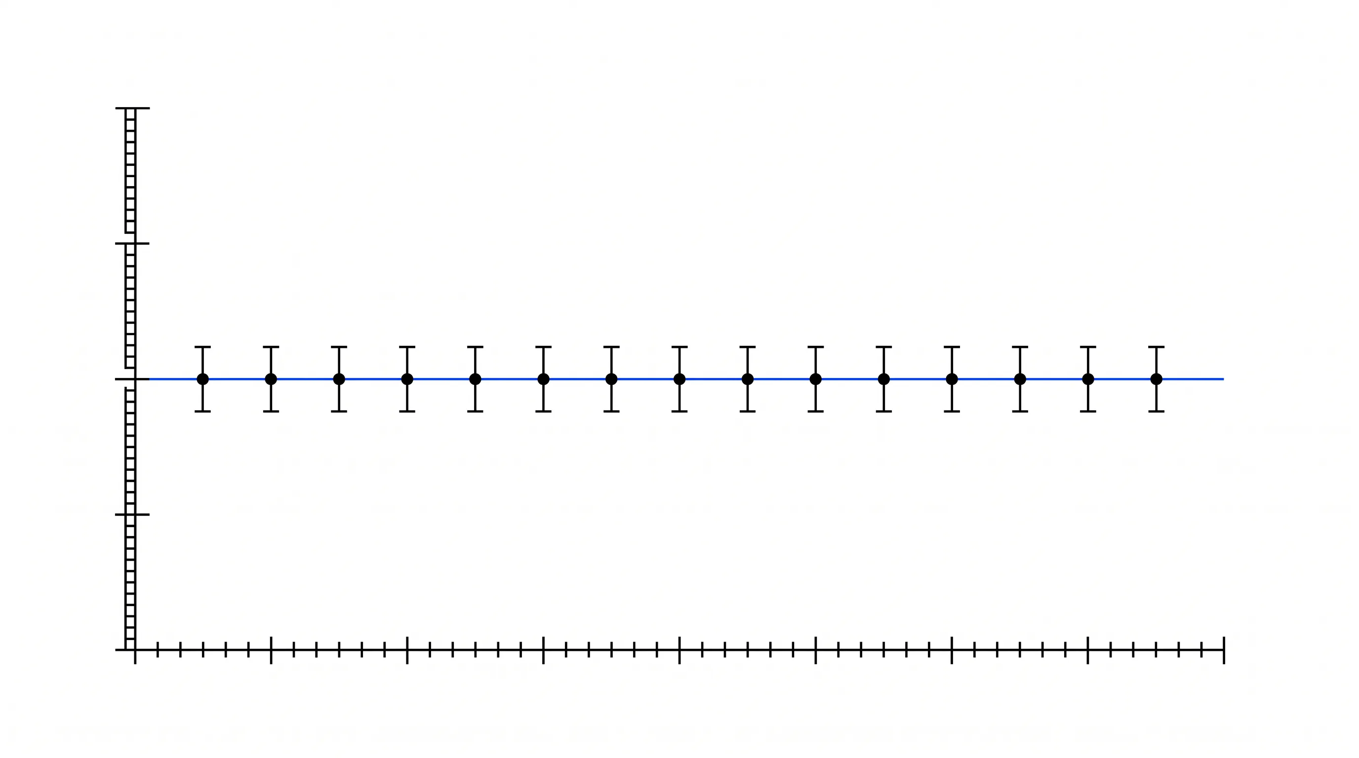
Visual form makes claims faster than labels do. Same size reads as same importance, and side by side reads as alternatives. An arrow reads as cause. Review figures for what their arrangement implies, with someone who does not already know the answer.
The pattern
Every element of the figure is correct. Three scientists have checked it. And the audience comes away believing something the company did not intend.
Because the pipeline bars are the same length, they think the second program is at the same stage as the first. Because the layout put two mechanisms side by side, they think the two are alternatives. A step looks optional to them because it is drawn in a lighter gray that someone chose for contrast.
None of those readings is stated anywhere in the figure. The figure supports all of them.
Why it breaks
Visual form makes claims without labels, and it makes them faster.
Same size reads as same importance. Side by side reads as comparison or as alternatives. Above reads as before. An arrow reads as causation. A shared axis reads as a shared scale. A color used twice reads as one category.
Those readings happen in the first second, before any label is read, and a caption does not override them. Healey’s vision research at NC State treats features like size, length and color as preattentive, meaning the eye picks them up in about a quarter of a second, before anything is read. If the visual claim and the written claim disagree, the visual one wins.
Scientific review does not catch this because it reads the figure the way a specialist reads, element by element, checking each against what they know. A specialist supplies the missing context without noticing. The investor lacks that context and reads the shape.
What changes
Review figures for what they imply as well as what they state, and do it with someone who does not already know the answer.
That means a second review pass with three questions. What does this figure claim by its arrangement? Which of those claims did we intend? Where the form is saying something we did not choose, is that a labeling fix or a structural one?
Most of the time it is structural. Two things that must not be read as alternatives should not share a row. A pipeline where stage is meaningful needs a stage axis and unequal bars. Do not draw a required step faintest.
The practical result
Fewer questions that are corrections. The recurring ones are “so are these two competing?” and “is the second one further along than I thought?” They come from the figure and stop when it stops implying them.
It also removes a specific and expensive risk, a figure that overstates. A pipeline graphic that makes a preclinical program look clinical is a claim, made visually, that the company did not intend to make and would not put in writing.