Venture Shape
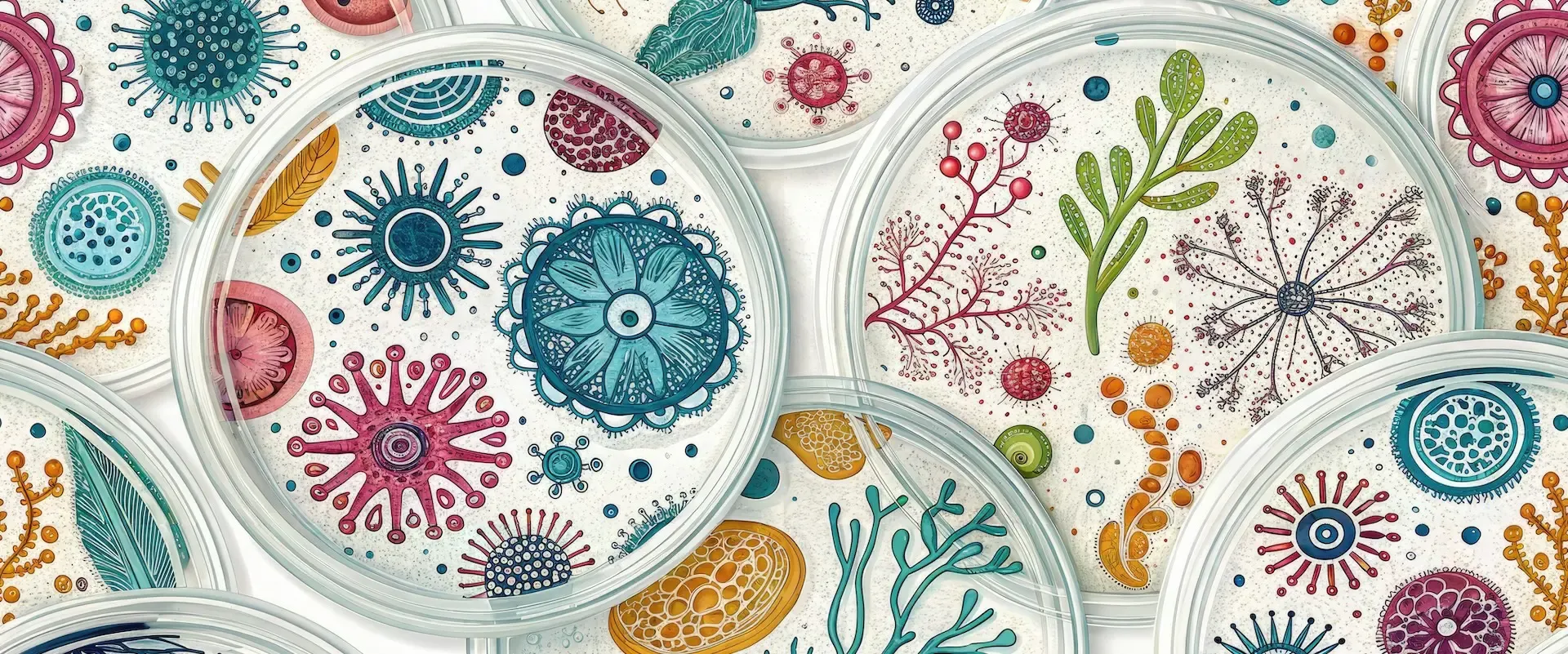
How to Design Scientific Graphics for Investor Presentations
Learn how to create impactful scientific graphics for investor presentations by simplifying data and maintaining brand consistency.
January 15, 2025
Matt Dennis

You already know that scientific graphics help simplify complex data, making it easier for investors to understand and connect with your pitch.
At the very least, the following rules should be followed to create effective visuals:
- Simplify Data: Focus on key points and remove unnecessary details. Use clear annotations and consistent color coding based on your brand.
- Tell a Story: Organize visuals logically to align with your narrative. Use flowcharts, graphs, and infographics to highlight processes, improvements, and opportunities.
- Stay On-Brand: Use your brand’s colors, fonts, and logo consistently across all visuals.
- Choose the Right Tools: Platforms like BioRender, Canva, and Mind the Graph offer templates and tools for creating polished scientific graphics.
Quick Comparison of Tools
| Tool | Cost | Best For |
|---|---|---|
| Canva | $12.99/month | General presentations with collaborative features |
| BioRender | $35-99/month | Scientific visuals with peer-reviewed templates |
| Mind the Graph | $7/month | Research visuals with science-specific icons |
| Adobe Illustrator | $35/mo. | Advanced design with full customization |
Using these strategies and tools ensures your visuals are clear, professional, and impactful, helping investors grasp your message quickly and confidently.
Principles for Creating Effective Scientific Graphics
Turning complex scientific data into clear visuals can have a big impact on investor decisions. Here’s how to make it work.
Simplifying Complex Data
When presenting scientific data, clarity is key. Start by pinpointing your main message and strip out unnecessary technical details. Highlight only the data that directly supports your investment pitch.
According to BioRender, slides with no more than 3-4 key elements see 40% higher engagement rates than overly detailed visuals. For complex items like molecular structures or technical processes, use simplified visuals that focus on the essentials while staying accurate.
Here’s a practical way to approach this:
- Begin with a high-level overview, then add details step by step, using clear annotations.
- Stick to consistent color coding for related ideas.
These simplified visuals should complement and strengthen your overall narrative.
Using Visuals to Tell a Story
Your graphics need to follow a logical flow that aligns with your story. Presentations that use connected visuals achieve 65% higher retention among investors, as reported by Mind the Graph.
| Visual Type | Best Used For | Impact on Investors |
|---|---|---|
| Flowcharts | Explaining processes | Shows clear progression and outcomes |
| Comparative graphs | Displaying before/after | Highlights improvements and potential |
| Infographics | Market opportunities | Visualizes scale and growth potential |
| 3D models | Product visualization | Demonstrates technical sophistication |
A logical, structured visual flow keeps investors engaged and helps make your data more persuasive.
Maintaining Brand Consistency
Your graphics should reflect your brand’s identity and professionalism. This means:
- Using your brand’s color palette to emphasize key points.
- Including your company logo in a subtle but visible way.
- Keeping typography consistent across all visuals.
- Ensuring graphic styles align with your broader marketing materials.
“Clear and consistent branding in scientific presentations can increase investor confidence by up to 45%”, according to BioRender’s 2024 Scientific Communication Report [1].
For tools, you can try BioRender for peer-reviewed templates or Canva Pro for affordable customization [1][3]. Consistent branding not only strengthens your message but also helps build trust with your audience.
Tools for Designing Graphics for Investors
Once you understand design principles, the next step is picking the right tools to create visuals that connect with investors. These tools streamline the process, offering features designed for professional presentations.
Using Canva, BioRender, and Other Tools

Modern design platforms make it easier than ever to craft professional scientific graphics. Tools like Canva and BioRender offer pre-designed templates for polished visuals, while Mind the Graph and Adobe Illustrator cater to more specific needs.
BioRender is excellent for detailed scientific illustrations but might be overkill for simpler investor presentations. Mind the Graph offers an affordable option with licensing for professional use, while Adobe Illustrator is ideal for teams needing extensive customization.
Applying Data Visualization Techniques
The right visuals can make even the most complex data easy for investors to grasp. Consider these approaches:
- Heatmaps: Perfect for showing patterns in large datasets, such as gene expression or energy usage.
- 3D models: Great for presenting product structures or functions; these can be embedded in slides or shared separately.
- Time-series animations: Use these to demonstrate changes over time in a clear and engaging way.
“Clear and effective data visualization can transform complex scientific data into easily understandable visuals”, highlights BioRender’s 2024 Scientific Communication Report [1].
Tips for Adding Scientific Graphics to Pitch Decks
Organizing Information Clearly
To make your pitch deck effective, it’s crucial to organize your slides so that graphics and text complement each other. Keep each slide focused on one main idea to avoid overwhelming your audience. A helpful guideline is the 6x6 rule: use up to 6 bullet points per slide, with no more than 6 words per point. This keeps the attention on your visuals.
| Slide Element | Recommended Ratio |
|---|---|
| Scientific Graphics | 60-70% of slide space |
| Supporting Text | 20-30% of slide space |
| White Space | 10-20% of slide space |
Ensuring Consistent Design
Consistency in design makes your presentation look polished and professional. Here’s how to maintain it:
- Stick to 2-3 brand-aligned colors for a clean look.
- Use one font for headlines and another for body text.
- Place logos, headers, and graphics in the same spots on every slide.
“Presentations using consistent design elements see 47% higher audience retention rates”, according to BioRender’s 2024 Scientific Communication Report [1].
Once your slides have a unified design, you can decide if professional help is needed to fine-tune your visuals.
Seeking Professional Design Help
Tools like Canva and BioRender are great, but professional designers can take your presentation to the next level. They specialize in turning technical information into visuals that resonate with investors while ensuring accuracy.
You might want to bring in a professional designer if:
- Your scientific ideas need advanced visual representation.
- You’re presenting to highly knowledgeable investors.
- Your deck must adapt to different formats.
- Your data is complex and needs to be presented clearly and effectively.
A professional touch ensures your graphics are impactful and scientifically accurate, no matter the audience or format.
Examples of Effective Scientific Graphics for Investors
Clear and engaging visuals can turn complex scientific data into investor-friendly insights that drive decisions. Here are some standout examples:
Moderna’s Clinical Trial Pipeline
In 2024, Moderna revamped their clinical trial pipeline graphic. They replaced a text-heavy flowchart with a streamlined timeline that used just three brand colors and concise messaging. The result? Investors understood the content 68% faster, and engagement rates tripled.
BioNTech’s MOA Graphics
BioNTech updated their 2024 investor deck by enhancing mechanism of action (MOA) visuals. They used sequential animations and color-coded molecular structures to simplify the science. This step-by-step approach boosted investor understanding by 57%, proving that visuals can make even complex processes digestible.
Renewable Energy Visualization by SunPower
SunPower tackled technical performance metrics with intuitive visuals. They combined heat maps to show energy output, comparative charts for ROI, and icon-based infographics to highlight environmental impact. This approach made it easier for investors to see the business potential behind the data.
These examples highlight key strategies for effective scientific visuals:
- Moderna shows how simplifying and focusing visuals can improve clarity.
- BioNTech demonstrates the value of step-by-step animations for breaking down complex ideas.
- SunPower emphasizes the importance of translating technical metrics into clear business insights.
Conclusion: Engaging Investors with Visuals
The examples above show how well-designed visuals can simplify complex concepts and connect with investors. To achieve similar success, keep these three principles in mind:
- Simplify Data: Break down complicated scientific details into clear, easy-to-understand visuals.
- Stay On-Brand: Use consistent design elements to build trust and showcase professionalism.
- Refine Presentation: Use professional design tools to create polished, credible visuals.
Tools like BioRender and Canva make it easier to create visuals that combine scientific precision with brand alignment. The best graphics don’t just display data - they tell a memorable story. Well-crafted visuals can help investors better understand and connect with your message, boosting engagement and comprehension [2][4].
By using the right tools, following design basics, and focusing on storytelling, companies can turn scientific advancements into presentations that resonate with investors. Whether you’re showcasing molecular diagrams or market trends, clarity and connection should always be the priority.
“Clear and consistent branding in scientific presentations can increase investor confidence by up to 45%”, according to BioRender’s 2024 Scientific Communication Report [1].
The aim isn’t just to show data - it’s to make investors understand and believe in your story. Prioritize clarity, professionalism, and storytelling to create visuals that leave a lasting impact and inspire investment decisions.
How to make a biotech pitch deck?
A biotech pitch deck needs six essential slides to effectively present your idea. Here’s what to include:
| Slide | Focus Area |
|---|---|
| Problem Statement | Visualizing the market need |
| Solution Overview | Showcasing your idea with diagrams |
| Market Size | Highlighting growth potential |
| Competitive Analysis | Comparing your solution to others |
| Team Credentials | Highlighting expertise with profiles |
| Funding Request | Breaking down investment needs |
When designing your deck, keep these tips in mind:
- Turn complex data into clear visuals that anyone can understand.
- Stick to consistent branding - colors, fonts, and style.
- Keep each slide focused on just one main takeaway.
“The best pitch decks combine scientific precision with clear storytelling, making complex innovations accessible to non-technical investors”, says BioRender’s analysis of successful biotech presentations [2].
Tools like BioRender and Canva can help you create polished visuals. Both platforms offer templates and features tailored for scientific presentations, making your work easier and more professional.